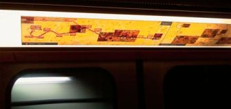
Toulouse’s metro, who had this great idea?
Inside each of the wagons of the Toulouse’s metro, two network maps are displayed so you can easily spot the station names, order and BUS/Metro connections as you ride. However, since the opening of line “B” in June 2007, some BUS lines have been re-organized in order to cope with the “new and unpredictable” affluence that has been noticed at some stations. This lead to a change in the connections map.

Now, instead of re-printing the whole two maps in order to report the new connections in a clean way, the administrators have preferred a cheaper solution which consisted of only re-printing portions of the maps and overlaying these new fragments on top of the existing maps. The result is what can be seen above…
I wonder who had this brilliant idea and how he managed to perform the “feasibility” tests and get a go ahead on this project. Obviously, the result is useless and the work has to be re-done. I wonder what the total costs here will be and if they’ll exceed the cost for a total re-print which would have been the easiest solution.
Another great example of wasted tax money…


Nice kindergarden exercice for the administration people! ;o) Cut and paste… sounds like they’re having fun!